UX Design
App & Responsive Website Design
Product: SAYWHAT
Project Overview
The Challenge
Users have varying requirements for interpretation services. Some may need assistance with document translations, while others may require an interpreter but cannot afford a full-time one, making communication with others a challenge.
The Goal
Design an app for users who need or want to schedule interpretation services and know that someone will assist them in being understood.
The Role
UX Designer – leading the app design and responsive website from idea to completion. User research: interviewing, usability study; wireframing: paper, digital; Prototyping: low-fidelity, high-fidelity; iterating on design; determining information architecture; creating responsive designs.
Understanding the User & Starting the Design
Research
I found that there is a barrier for users who are non-English speaking to have access to equitable services that are provided. English speakers can read the forms to receive the service and understand what is being explained to them. However, non-English speakers are disadvantaged since they do not know what forms to use or how to fill them out. The feedback showed that having the ability to scan a document for translation or schedule an appointment for an interpreter would increase the quality of life for the users.
Ideation
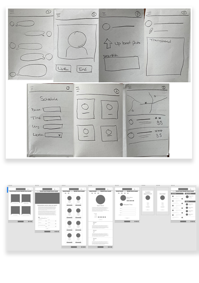
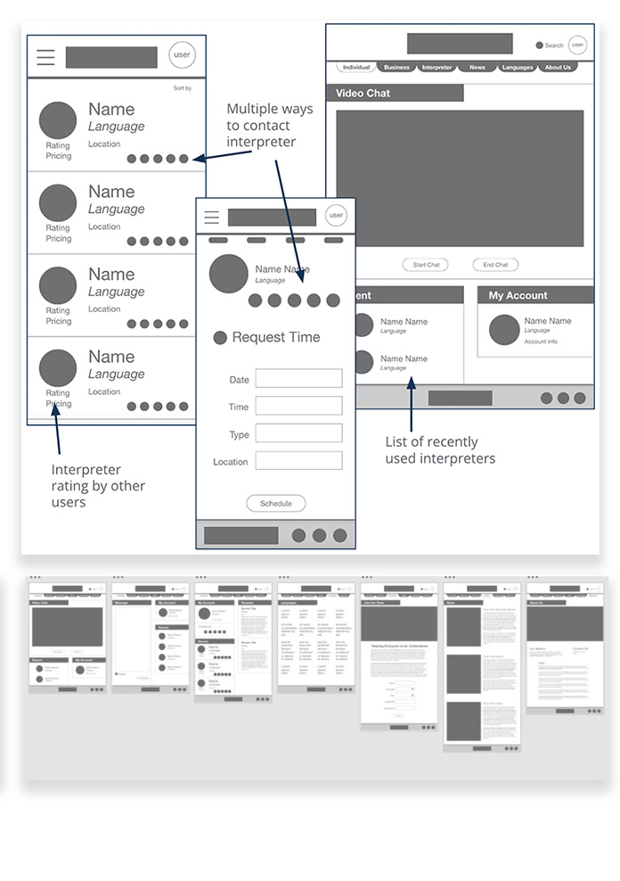
During the ideation phase, I focused on the different ways that users would need to access interpretation services (chat, messaging, video, document upload, and in-person) and on a way to see how other users rated interpreters.
Usability Study
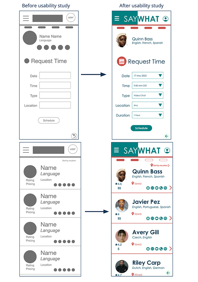
Users wanted to select the duration of an appointment.
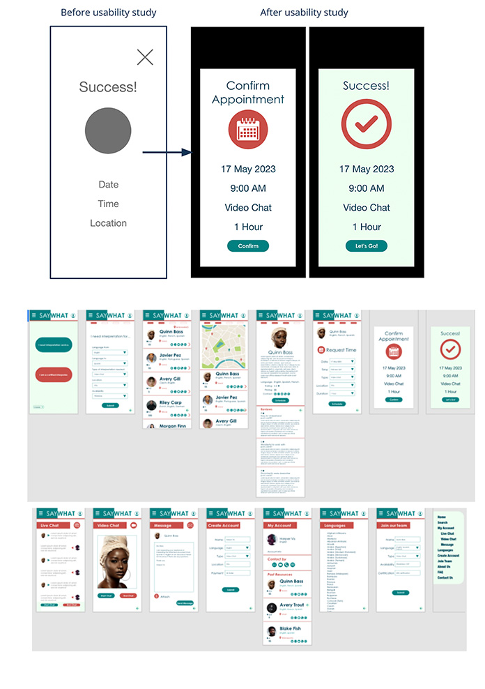
Users wanted to confirm the scheduled time before making the booking.
Once the interpreter list appeared, the user wanted an arrow to indicate where to go next in the process.
Refining the Design
Mock-Ups
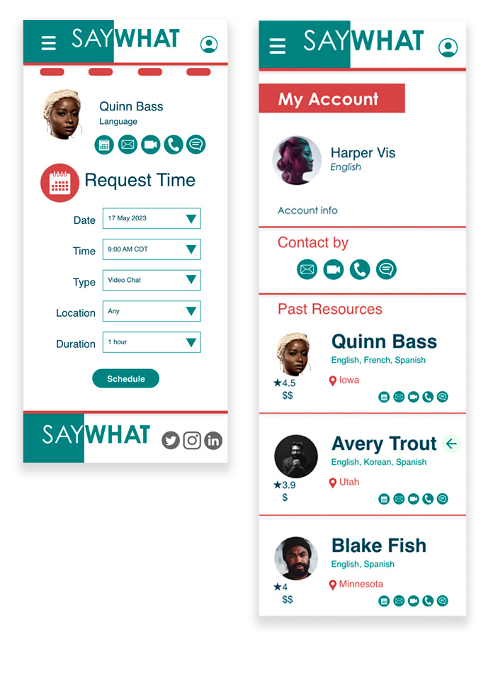
Insight 1: The Usability Study showed that having a duration option available when booking an interpreter would be helpful.
Insight 2: The Usability Study also shows that users wanted to have a confirmation page before completing the booking.
Insight 3: The Usability Study showed that users preferred more direction during the scheduling process. This was done two ways, first by adding an arrow on the interpreter sections, and second by showing progress at the top, so the user would know how many more steps to complete the task.
Accessibility Considerations
Users can select the languages that they translation services between.
Colors contain contrast for better readability. The text would be easily read by a screen reader.
Iconography will help users with a language barrier.
Responsive Design
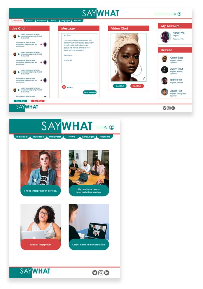
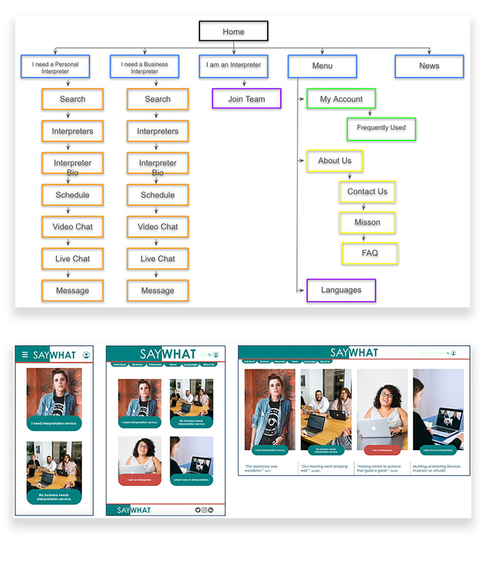
Information Architecture: The SAYWHAT app was the first step in these creations. Both the app and the website are driven by the needs of the user.
Responsive Designs: Designing the site for mobile, tablet, and desktop viewing I kept the buttons similar so users would know where to go.
Responsive Website & App
Video Walkthroughs & Functional Prototypes
Take Aways
Impact
This app and responsive website have the possibility of helping users that have a language barrier.
What I learned
Creating a site for multiple platforms is a great way to look at what is needed and how something can be better designed for more users.
