UX Design
Responsive Website Design
Product: Art Gallery
Project Overview
The Challenge
Patrons of an art gallery would like to know more about the artists on exhibit and be able to see other works that the artists have created.
The Goal
I want to create a website for art lovers who want to learn more about the artists on display at their favorite galleries. The site will provide bio information about the artists, their prior works, and when they will be displayed.
The Role
For this student project, I was the UX from start to finish. I conducted research for the website and created wireframes and low-fidelity and high-fidelity prototypes.
Understanding the User & Starting the Design
Research
I conducted interviews to research users’ needs for an art gallery website containing artists’ bios. I found that most users were working adults who had an interest in art. My research also found that users want to not only have biographical information regarding artists but would also like to see images of artists’ work from different stages of their ability. They were also frustrated when they did not know which artist’s work would be displayed at the gallery.
Ideation
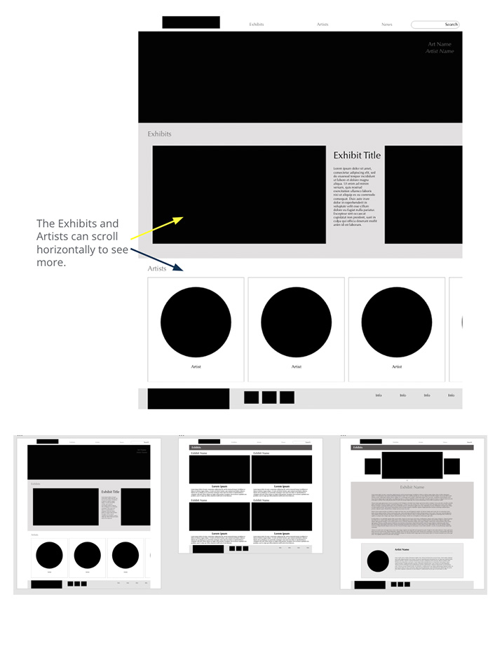
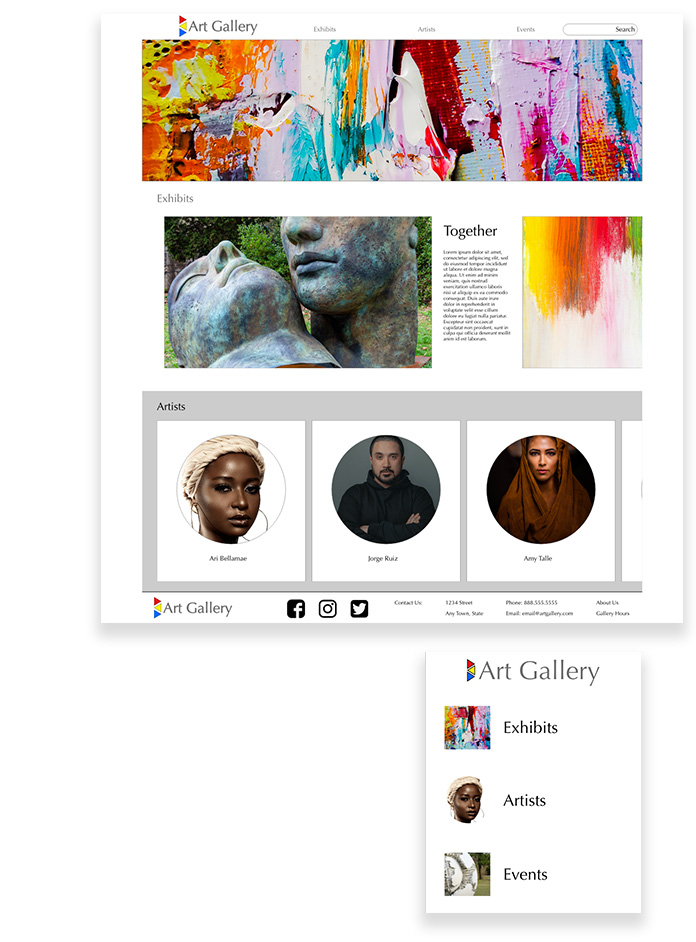
The goal was to allow users to be able to quickly see the current exhibit and artist information by scrolling through those areas.
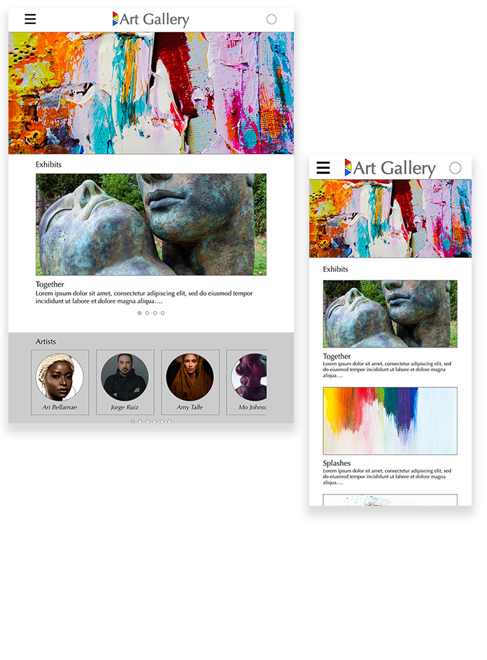
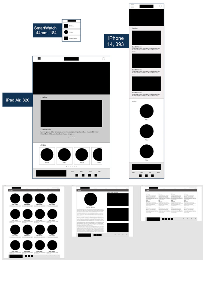
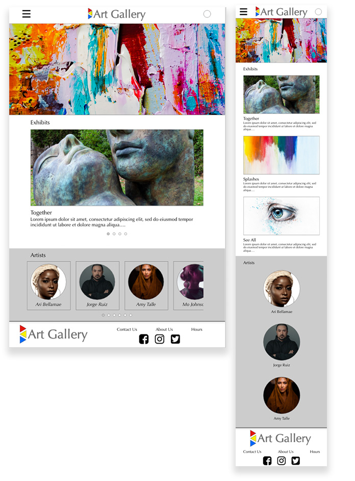
The SmartWatch design has a simple menu that takes the user to the other pages. The iPad design is a scaled-down variation of the web desktop. The iPhone design switched key items to be viewed vertically instead of horizontally.
Usability
Users did not understand why the page was labeled News instead of Events.
Users wanted to be able to return to the homepage whenever they clicked on the logo.
Users wanted to be able to access the Artists page when the artist is listed on the Events page
Refining the Design
Mock Ups
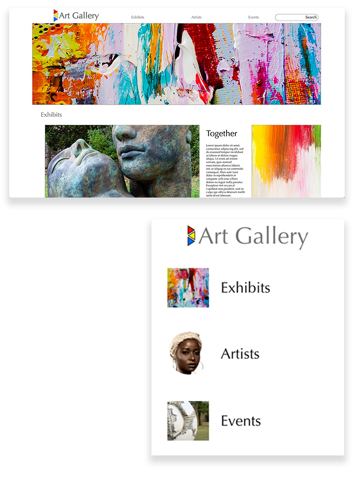
The images and elements from the homepage are carried across multiple platform sizes.
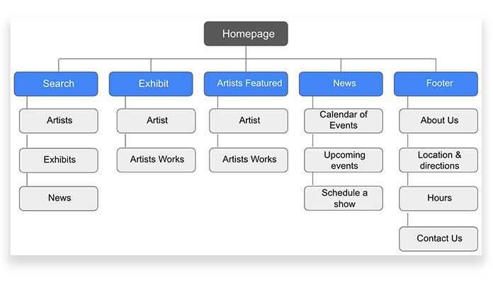
The user will be able to flow from the homepage through the exhibit page to the artist bio page.
Accessibility Considerations
Screen readers will be able to read descriptions of artwork shown on-site from the alternate text associated with each image.
The screen readers will be able to follow the flow because of the hierarchy the text is using.
Text will be legible and in good contrast with the background for low vision impairment.
Responsive Design
Information Architecture: flow of the site
Responsive Design: When designing the site for mobile, tablet, and desktop viewing, I kept the buttons similar so users would know where to go.
Take Aways
Impact
These designs will help users find more information regarding artists and exhibits at their local gallery.
What I learned
Creating a site for multiple platforms is a great way to see what is needed and how something can be better designed for more users.
